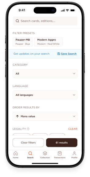
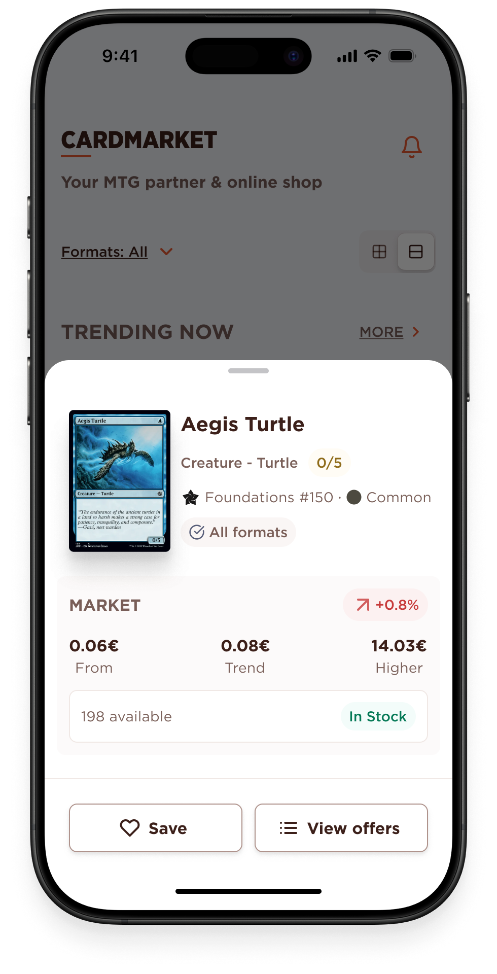
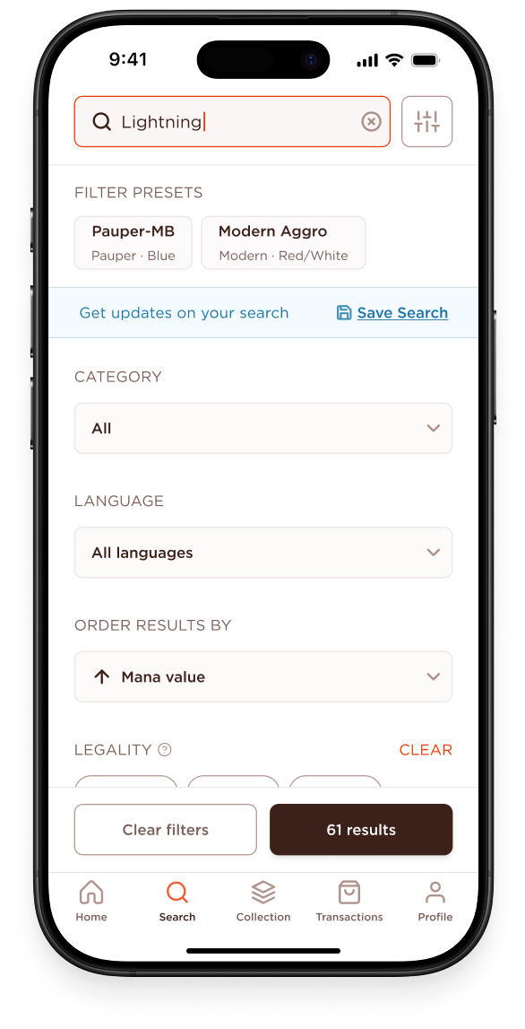
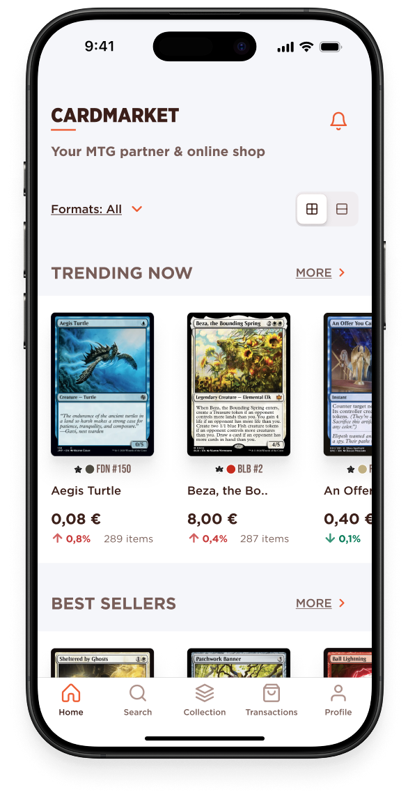
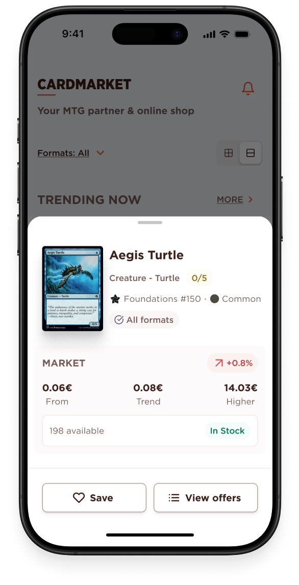
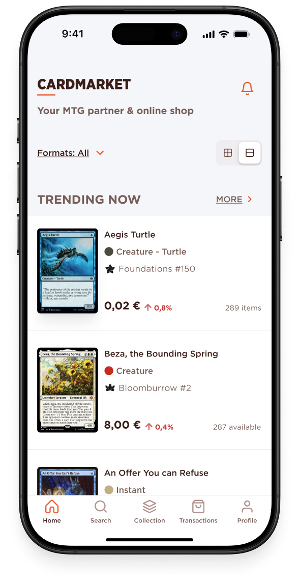
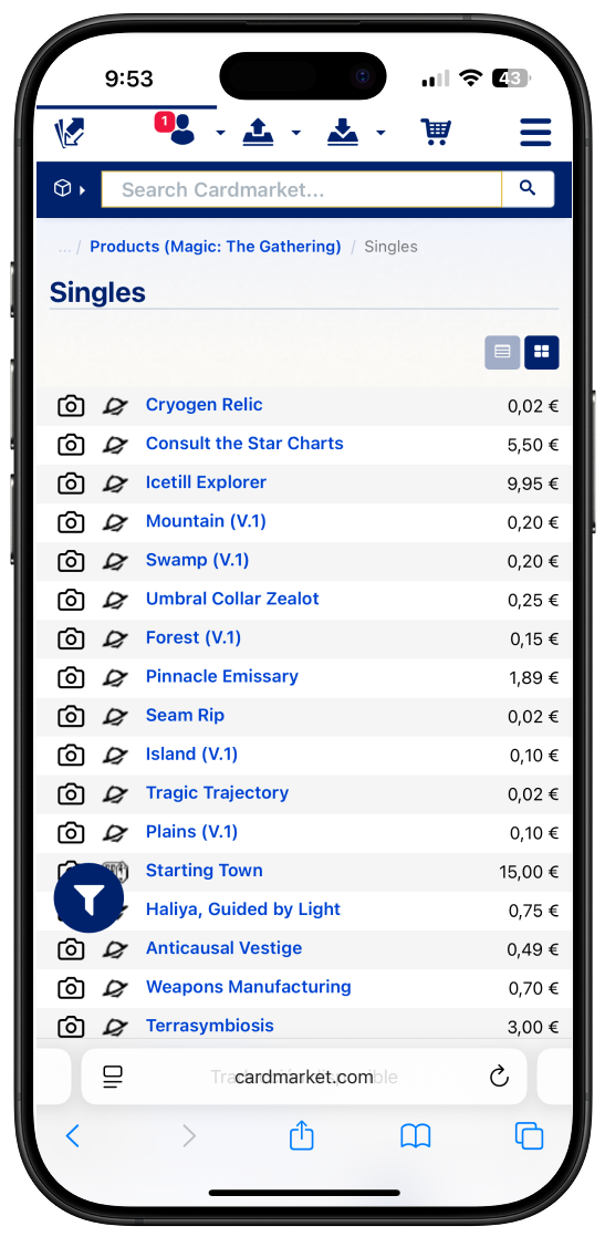
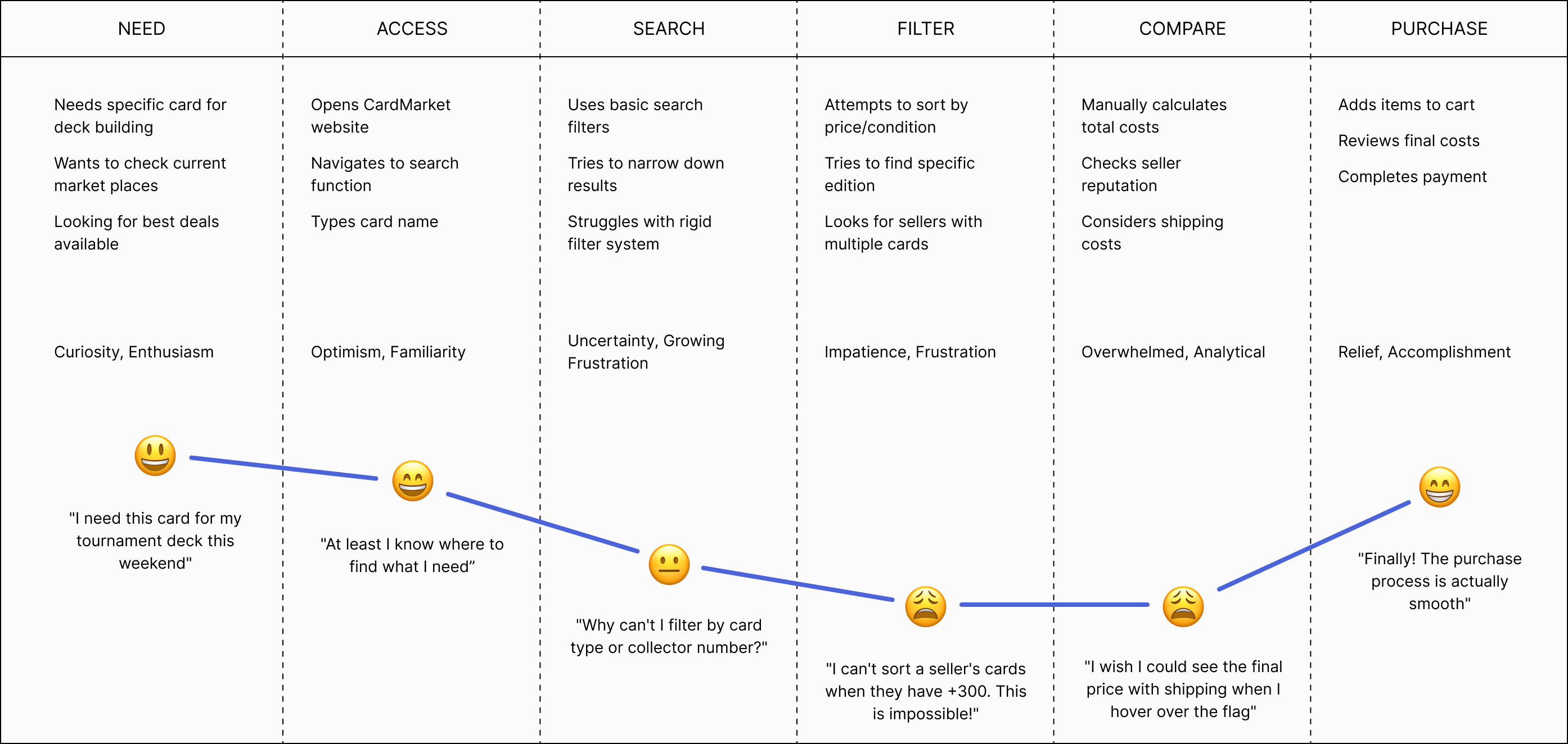
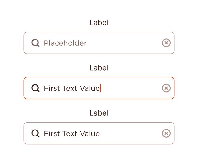
MTG online store app Lara Bautista
Back to projects

MTG online store app

Role: UX, UI, case study

Type: Case study

Time: 2 months

CardMarket dominates Europe's trading card games market, yet its tools feel stuck in 2010—sellers juggle spreadsheets to list cards, while buyers battle rigid search systems. For a community built on passion (not profit), these friction points undermine the joy of collecting. MTG players struggled with desktop-heavy platforms that weren't optimized for mobile trading. Users needed quick access to card prices, collection management, and seamless purchasing on-the-go. This project redesigns two pillars—search and collection tools—to reflect how TCG enthusiasts actually interact, trade, and compete today.

Research

What are the most common issues users have with the current CardMarket website?

How we do it?

+ Desk research+ Benchmark+ User interviews+ Surveys

Benchmarking and desk research reveal the importance of the interaction between the physical and digital worlds for traders. Digital tools such as bulk-uploading cards, filters for searching and responsiveness design are considered for their process.

Current app home feed
Original design

What people said?

“Uploading cards individually is hell. I waste more time listing than selling.”

“Why can’t I upload an Excel spreadsheet with my 500 cards? Doing it one by one makes me give up.”

“The filters are so rigid that I end up buying them on eBay out of desperation.”

What numbers said?

81.8%of users rely on CardMarket as their primary card purchasing platform
40.9%actively sell cards, with nearly half (44.5%) managing inventories of 500+ cards
72.2%find the current card upload process frustrating and time-consuming
Card detail tile 1Card detail tile 2Card detail tile 3Card detail tile 4

The real question

How might we improve the online experience from the cardmarket shop creating a mobile-first experience for the MTG Community?

Ideation

User journey map

To understand user behavior during the process of searching for and purchasing trading cards through CardMarket, we analyzed the current user journey map. We found that users experience their lowest satisfaction points during the search and filter phases, where rigid filtering systems and limited sorting options create significant friction. While the journey begins with high enthusiasm and concludes with a positive purchase experience (rated 8.0/10), the middle phases reveal critical pain points that drive 42.9% of users to consider switching platforms. This pattern highlights a crucial disconnect between CardMarket’s strong market position (81.8% use it for purchases) and user experience quality, revealing clear opportunities to transform the search and discovery process while maintaining the platform’s successful purchasing capabilities.

User journey map showing pain points in search and filter phases
User journey

Style guide

Aa Bb Cc 123
Headings
Aa Bb Cc 123
Text Body
Aa Bb Cc 123
Captions

Components

Button components
Button componentsCard tile componentsIcon systemTab bar componentText field components
Text Strong #4D0F00
Text weak #330A00
Brand color #EA3601
Backgrounds #801A00

“I want to maintain the MTG color palette and vibes”

The challenge

The proposed solution was to create a mobile app, focusing on an engaging search experience and a user-friendly interface that really helps users to have under control their card collection.

During the ideation phase, we discovered that every card required a significant amount of detailed information to be shown, so we had the challenge on how to structure the information effectively to ensure it was clear and accessible, considering the diverse priorities of users regarding card details.

iPhone mockup frame

Moving research to design

Insight #1

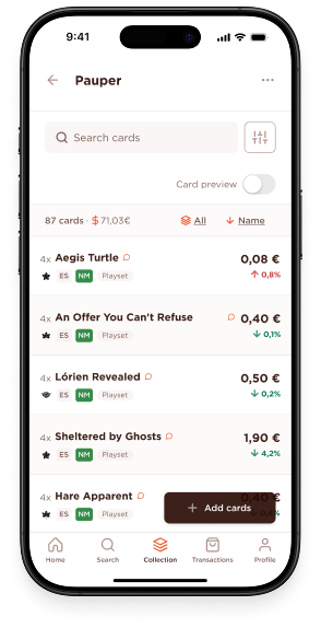
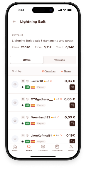
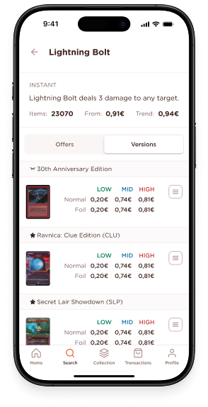
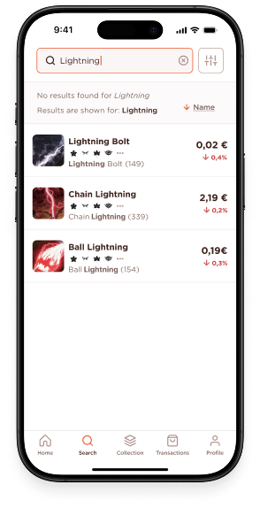
Users stated that the search feature does not fit their needs when looking for cards with specific characteristics or combination of them. What leads them to abandon their search or find their cards by other ways.

How we approach it

With this in mind, the redesign places the search process at the heart of the user experience, reflecting its central role in the users workflow. Refined search options and the ability to save search filter combinations are seamlessly integrated, creating a personalised and intuitive flow for every user ensuring they can easily customise and revisit their preferred search configuration, making the interaction both efficient and engaging.

Enhanced search interface with filters

Insight #2

Users use the platform not only for buying cards but also to sell them, and they feel very disconcerted about there’s no way to upload bulk of cards in a more seamlessly way

How we approach it

The app design emphasizes not only the existent features in card market, but adds new features as the bulk card upload option importing them from a .csv file.

Bulk card upload interface

Insight #3

MTG players want to have control of their collection, so when they’re interested in selling or buying cards they often go and check their collection first.

How we approach it

By creating a simple but effective collection manager, users can have control of their collection value, and the cards they want to buy or sell in the future.

Collection management interface
Card detail interface before usability testing
Before testing
Card detail interface after usability testing improvements
After testing

Usability testing

User interests and behaviors showed the need for a more personalized experience. Based on these insights, we updated the homepage with a two-tab layout, making navigation intuitive and keeping relevant content front and center.

We asked the participants to complete different scenarios and observe their patterns and behaviours while completing the goals. Through several rounds of feedback we were able to minimise the user’s effort and made key information more accessible.

App designs

Start where you haven’t stood before

Approaching Cardmarket as someone completely new to its ecosystem, I set out to explore the familiar territory of online marketplaces with a fresh lens. Instead of reinventing, I challenged myself to respect—and question—the systems already in place. This project made me realize that sometimes the greatest lessons aren’t found in what’s missing, but in what’s present and overlooked: habitual flows, notification mechanisms, and user priorities shaped by years of use.

Let research guide design, not just shape it

I immersed myself in user journeys from both buyer and seller perspectives, searching for subtle signals—like which notifications are acted on immediately and which are ignored. The process reminded me of browsing through a collection: patterns emerge when you pay attention to the order in which you pick things up, and why. Translating these patterns into design decisions (such as having clear, actionable categories and visually distinct order states) helped surface friction points that only a thoughtful, user- centered approach can reveal.

Non-users highlight the invisible

Since I didn’t start as a Cardmarket user, I could empathize with newcomers navigating a complex interface for the first time. This outsider viewpoint became an advantage, exposing what long-time users might have learned to tolerate or overlook. It pushed me to think about communication barriers, the clarity of notifications, and how separating purchases from sales can reduce confusion and lower the learning curve. Sometimes, removing steps—not adding features—is what opens up products for new audiences.

Top Next